
Brand Identity
SUBVERSIVE
NOSTALGIA
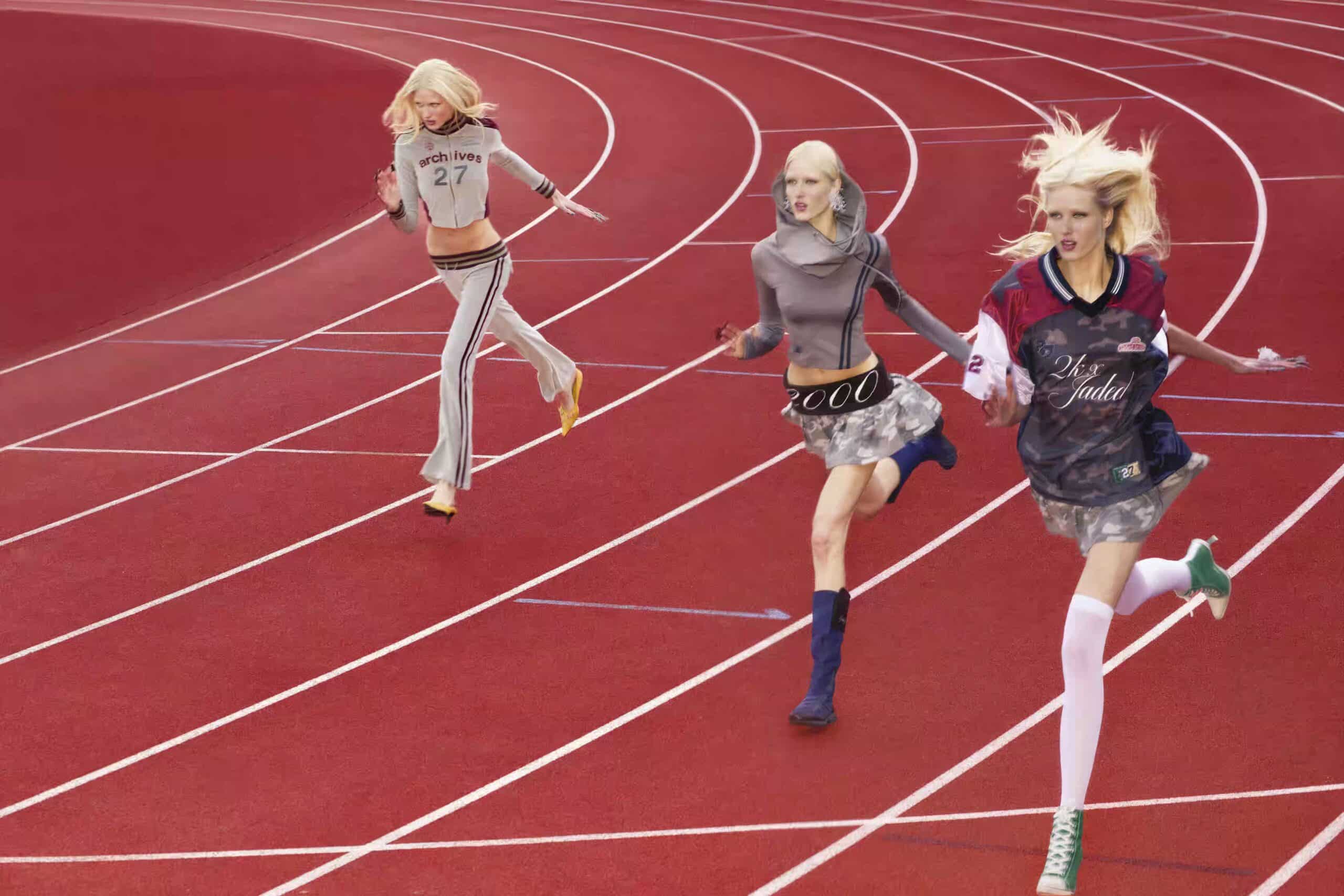
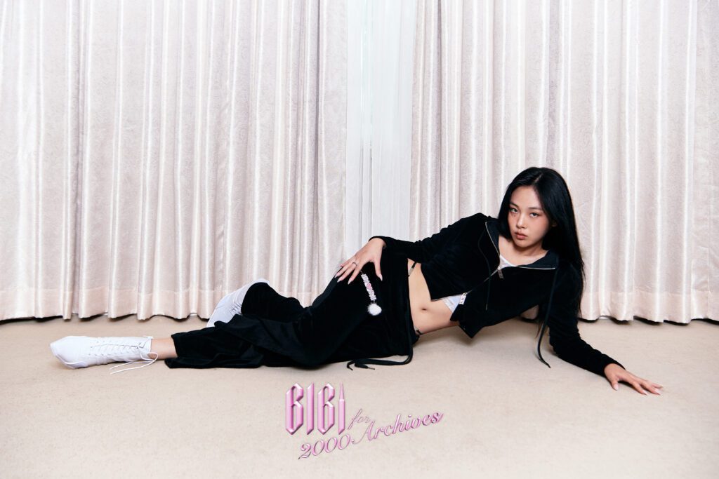
2000Archives is a raw exploration of millennium nostalgia, body-conscious silhouettes, and deconstructed craft.
The Manifesto
- 01Embrace the chaotic energy of the early internet. Perfection is sterile.
- 02Deconstruct the conventional silhouette. The body is a canvas for disruption.
- 03Find beauty in the distressed, the faded, and the imperfect.
We encompass both the ready-to-wear mainline and the artisanal 'Atelier' collection. Our visual identity is intentionally provocative, capturing the chaotic yet vibrant spirit of early internet culture and avant-garde fashion.
Every asset, color, and typographic choice is a deliberate nod to the past, re-engineered for the future. The brand embraces imperfections, high contrast, and a distinct lack of corporate polish.
02. Logo System
Mainline Wordmark (Horizontal)
The core identity for ready-to-wear. Raw, vintage elegance.
2000Archives
2000Archives
2000Archives
Mainline Wordmark (Square)
For profile pictures and compact vertical spaces.
Atelier Wordmark
The artisanal extension. Elevated and precise.
2000Atelier
2000Atelier
Monogram & Symbol
For hardware, tags, and compact spaces.
Care Label & Technical
Utilitarian marks for inside garments and packaging.
TRIM: 100% LEATHER
DO NOT BLEACH
TUMBLE DRY LOW
IRON LOW HEAT
03. Clear Space
Clear Space
To ensure the logo remains prominent and legible, always maintain a minimum clear space around it. This space is defined by the height of the capital “A” in the wordmark.
2000Archives
Minimum Size
To maintain legibility, the logo should never be reproduced smaller than the minimum sizes specified below for digital and print applications.
2000Archives
04. Incorrect Usage
2000Archives
2000Archives
2000Archives
2000Archives
2000Archives
2000Archives
05. Color Architecture
The color palette is stark, sensual, and unapologetic. Void Black and Second Skin create a high-contrast foundation inspired by body-conscious fashion. Archive Blue brings a distinct Y2K nostalgia, while Distressed Red and Metallic Chrome inject a raw, industrial energy.
Color Ratio
Void Black
Infinite Canvas / Deep Contrast
HEX
#000000
RGB
0, 0, 0
Second Skin
Body-Conscious / Primary Text
HEX
#E2D4C8
RGB
226, 212, 200
Archive Blue
Y2K Nostalgia / Faded Denim Accents
HEX
#A3C1D4
RGB
163, 193, 212
Distressed Red
Provocative Accent / Warnings
HEX
#8A1C1C
RGB
138, 28, 28
Metallic Chrome
Hardware / Cold Industrial
HEX
#8A8D91
RGB
138, 141, 145
Ash Gray
Faded Vintage / Secondary Backgrounds
HEX
#E5E5E5
RGB
229, 229, 229
06. Typography Rules
Part 1: UI & Editorial Graphics
Display / Headings
Anton
SUBVERSIVE NOSTALGIA
SUBVERSIVE NOSTALGIA
Body / UI Text
Inter Regular
The workhorse typeface for all body copy, UI elements, and technical data. Ensures maximum legibility. While headings are chaotic and tightly packed, body text must remain clean, breathable, and highly functional to balance the visual weight.
The workhorse typeface for all body copy, UI elements, and technical data. Ensures maximum legibility. While headings are chaotic and tightly packed, body text must remain clean, breathable, and highly functional to balance the visual weight.
Subheadings / Accents
JetBrains Mono / Courier New
System Architecture
System Architecture
Microcopy / Captions
Inter Light / Mono
FIG. 1 — ARCHIVE REFERENCE NO. 0042 SCANNED AT 1200DPI
FIG. 1 — ARCHIVE REFERENCE NO. 0042 SCANNED AT 1200DPI
Part 2: Apparel & Print Graphics
Typography used on clothing and physical graphics follows entirely different rules. It is highly expressive, often mixing ornate vintage styles with brutalist athletic fonts. The font itself becomes the graphic.
Vintage & Ornate
Gothicus, Aston Script, Cinzel
Used for romantic, dark, or vintage-inspired graphics. Often applied with distressed textures or rhinestones. Tracking is usually tight to connect script letters.
Gothicus
Dark / Subversive
Aston Script
Light / Romantic
CINZEL
Classic / High Fashion
Bold & Sporty
College, Impact, Racing Sans One
Used for football tees, varsity jackets, and aggressive streetwear graphics. Tracking is either extremely tight (Impact) or extremely wide (College).
COLLEGE
Dark / Varsity
Impact
Light / Aggressive
RACING
Speed / Motorcross
Care Labels & Technical
JetBrains Mono, OCR-A
Used for care labels, packaging stickers, and technical specifications. Evokes an industrial, utilitarian feel. Always use monospace fonts with neutral tracking.
Style: 2000A-FW26-01
100% Cotton / Machine Wash Cold / Do Not Bleach
Light / Utilitarian
Style: 2000A-FW26-01
100% Cotton / Machine Wash Cold / Do Not Bleach
Dark / Utilitarian
07. Graphic Patterns
Patterns are used heavily in backgrounds, linings, and digital assets to evoke specific eras and subcultures. They should feel raw, textured, and slightly distressed.
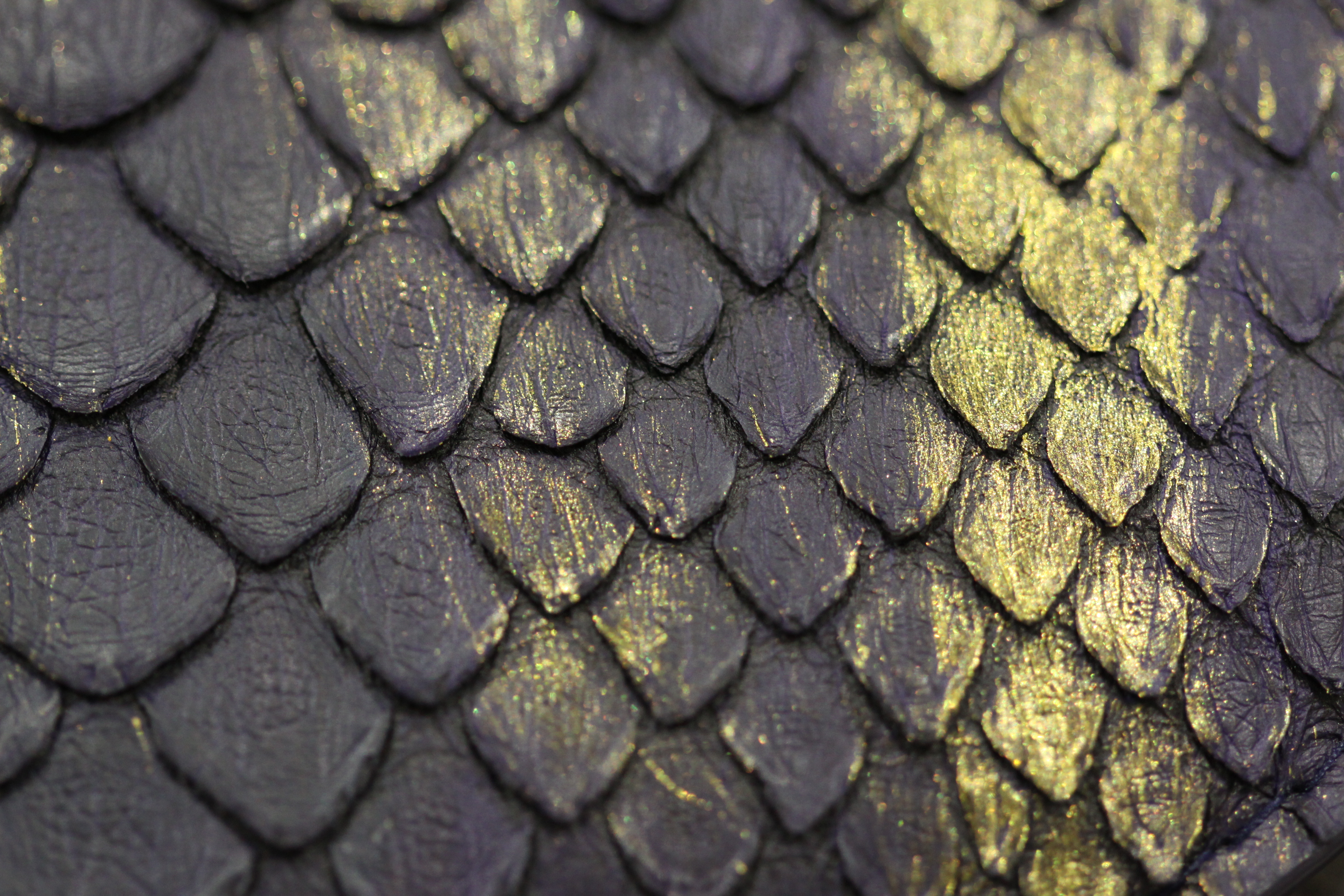
Snake Skin (뱀피)
Exotic, dangerous, and synonymous with Y2K luxury. Used for high-impact accents.
Application: Leather goods, Inner Linings
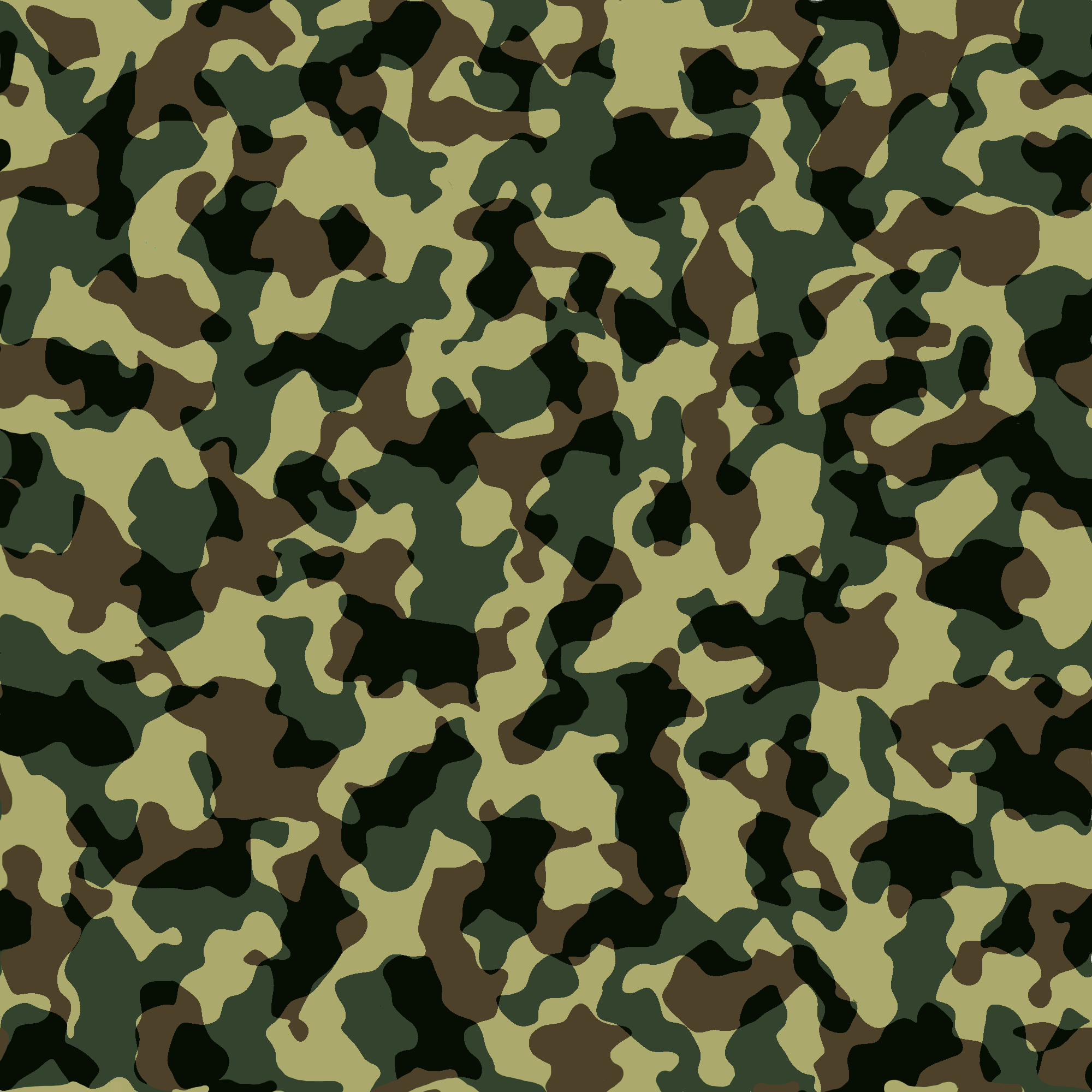
Camouflage (카모)
Subversive streetwear and utility. Represents a rebellious, anti-establishment attitude.
Application: Cargo pants, Mesh tops
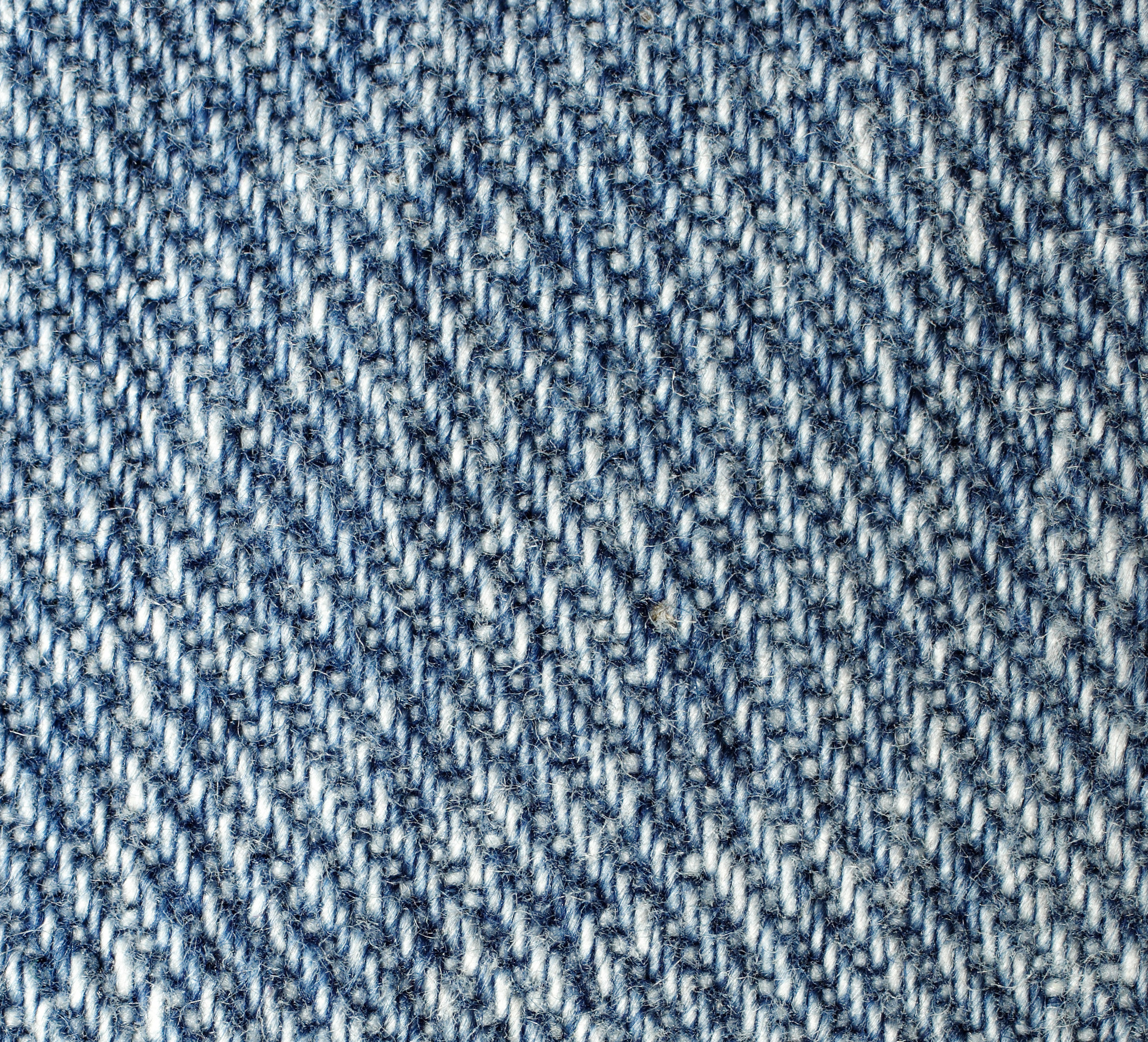
Washed Denim (데님)
Distressed, everyday uniform. Evokes a sense of lived-in nostalgia and grunge.
Application: Skirts, Jackets, Digital Backgrounds
08. Symbols & Motifs
Our symbols are not just decorative; they are ideological markers. They represent the tension between the sacred and the profane, the romantic and the brutal.
The Cross
Gothic, edgy, and subversive. It acts as an anchor for our darker, more provocative identity, often used in hardware and heavy prints.
Subversion / Anchor
The Rose
Signifies romanticism, fragility, and delicate vintage aesthetics. It provides a soft counterpoint to our brutalist typography.
Romanticism / Contrast
09. Apparel Language
The phrases and campaign names printed on our garments are cryptic, evocative, and slightly rebellious. They act as poetic fragments rather than direct marketing messages. The language must evoke an emotion before it communicates a meaning.
Cryptic Romanticism
01. Poetic Fragments
Language should feel like a torn page from a diary. It is intimate, slightly melancholic, and deeply personal. Avoid complete sentences; prefer evocative noun phrases or disjointed thoughts.
SUBVERSIVE CULT
02. Insider Identity
Slogans should create a sense of belonging to an exclusive, slightly rebellious group. It uses aggressive, bold typography to declare allegiance. The tone is confident, unapologetic, and raw.
The Void
03. Dark & Provocative
Words that evoke a sense of emptiness, rebellion, or dark aesthetics. Often paired with heavy blackletter or distressed fonts to maximize the visual impact.